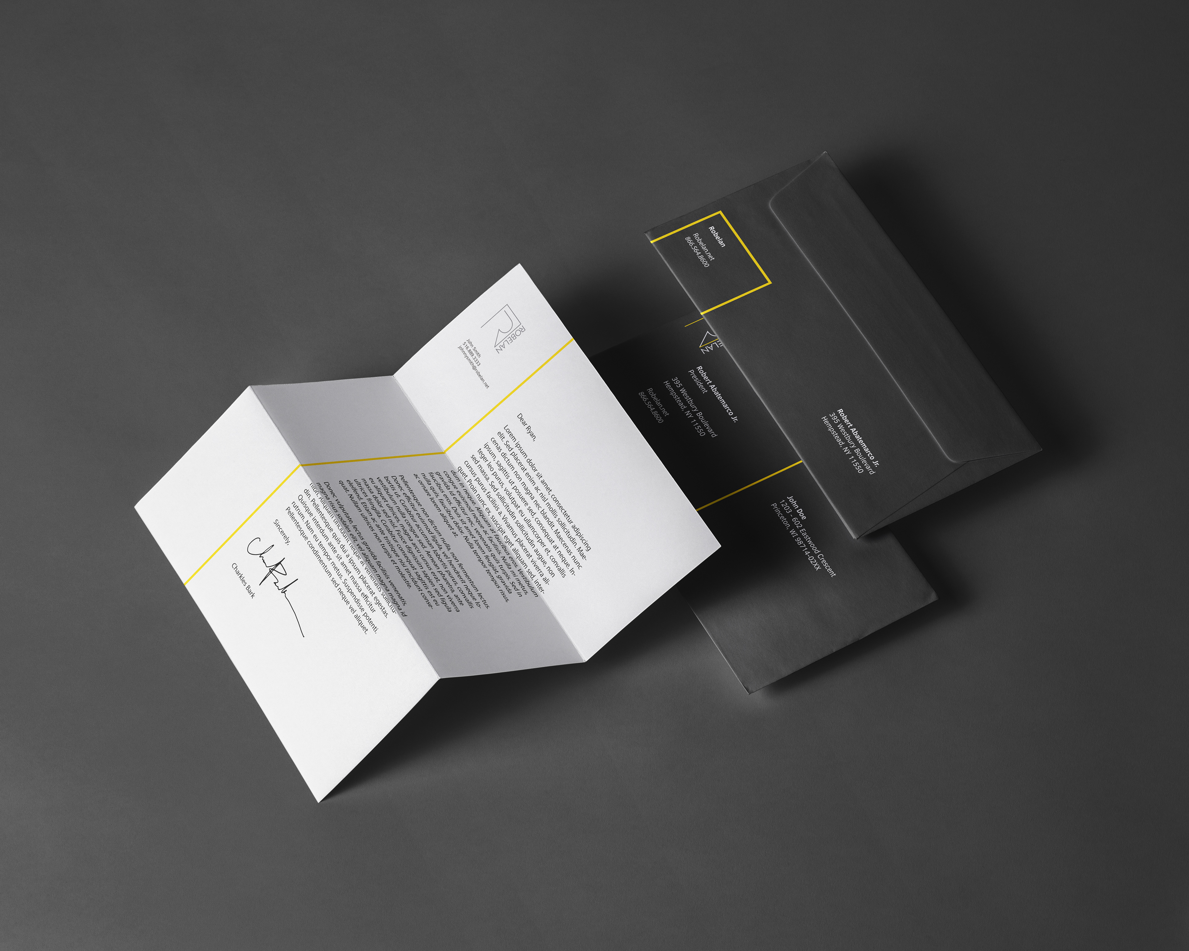
When I joined the Robelan team, they had me re-brand the company to help solidify their image across all mediums. We wound up choosing a particular yellow and incorporated the new logo's line work in all the pieces below.


A look-book for potential clients to browse our house stocked retail merchandise. This particular catalog called for a relatively different approach to the design. We wanted it to stand out compared to past catalogs, hence the lack of our standard yellow. (Below)


